Screen reader exercise
Test your knowledge
This screen reader exercise page contains several sections with WCAG accessibility violations. Using a screen reader, identify and fix all WCAG violations below.
Logical reading order
Focus order
Also known as "logical reading order," the concept of WCAG Success Criteria (SC) 2.4.3 refers to the sequential navigation order. In short, the order should not confuse the user.
In this "John Doe" profile example, the name appears first, followed by the phone number, a brief biography, and finally the email address. However, screen reader usage will reveal to you that these four pieces of information are not announced in that order. Ideally, the order of content announcement should match the order in which it appears on the page to sighted users whenever possible.
John Doe is a seasoned technologist with a passion for innovation and problem-solving. With over a decade of experience in the tech industry, he has worked on a wide range of projects and has a deep understanding of various programming languages and technologies.
Complex images
Images must have descriptive alt text
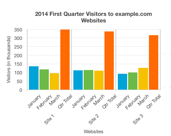
According to WCAG Success Criteria (SC) 1.1.1, all non-text content (including complex images like this one) must have text alternatives that provide equivalent information. The alt text for the image below, "2014 data," while factual, doesn't have enough details to describe exactly what is contained in the image. That's what makes this a WCAG 1.1.1 violation.
If this image had a caption containing a detailed description, you could use the same description for the alt text; however, if the caption isn't descriptive enough, the alt text has to pick up the slack with more details. Remember, alt text should be fairly concise, but keep in mind it should also be informative. How would you describe this graph to someone who can't see it?

Announcing actions
Name, Role, Value
WCAG SC 4.1.2 was already featured on the Keyboard exercise page ("An issue with a form-related element"), but here's a different example of how this guideline applies.
Not only must interface components be properly labeled (as seen on the Keyboard page), but they should also communicate state changes to the user that can be consumed and announced by screen readers. The collapsible accordion example below operates just fine as a button from a functional perspective, but a screen reader user will have no idea what activating this button actually does. Depending on the software used, it may just result in an audible "beep" indicating an unknown action, which isn't very helpful on its own to the user.
The best way to handle this is to: (1) add the 'aria-expanded' attribute to the button element, (2) add 'aria-controls' to the button with matching id in the content div, and (3) modify the script to change the value of 'aria-expanded' on click. The event listener must be entirely rewritten to accommodate this.
Content for Section 1
Content for Section 2
Verbosity
Keyboard (Level A)
WCAG 2.1.1 does not directly apply to this issue, but a good case could be made that the button below is not properly accessible to keyboard or screen reader users.
If a live region on the page must be updated with new data, it's important to consider how this information will be consumed by assistive technology. The button below generates a timestamp based on the user's system clock, but the output string is being appended to the live region rather than overwriting it. For sighted users like us, this would be a minor, perhaps annoying inconvenience, but for a blind user it could be more trouble than it's worth. If a screen reader user clicks this button multiple times, they'll have to listen to all the timestamps they previously generated before they reach the most recent timestamp; as a result, what was intended to be a nice feature, perhaps even a convenience, is now a not-very-helpful inconvenience.
Though you're unlikely to come across an issue like this in the wild (and probably less likely to create one yourself), it's important to always think about what screen reader users experience when they consume your dynamically-generated content. Use a screen reader when developing. Can you make this information easier to access?